LOGO DESIGN
Case Study: The Paisley Parrot
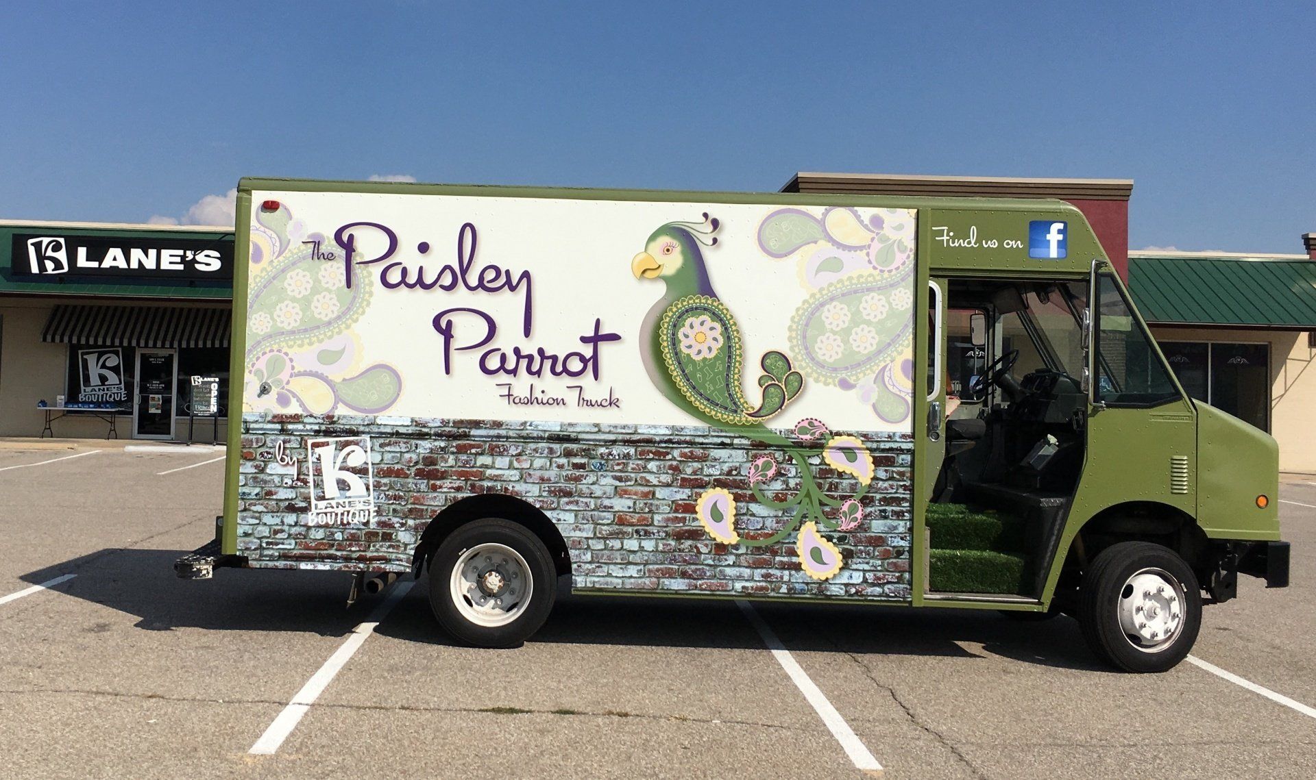
Were always thrilled to take on a new logo design. But when the owner of a successful string of fashion boutiques came to us for a logo design for her newest venture, The Paisley Parrot Fashion Truck, we knew that we needed a logo that could literally stand out amongst the competition--as in, parked side-by-side! In addition, the client had already purchased a truck and asked us to design a logo that would complement the existing color of the vehicle to minimize wrap costs.
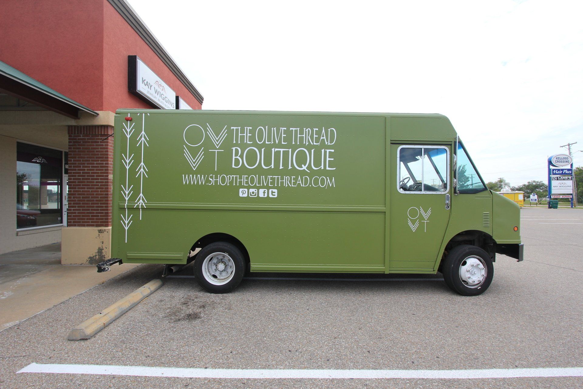
The truck was painted a shade of green that is most commonly seen on military vehicles and in woodland camouflage.
No problem.
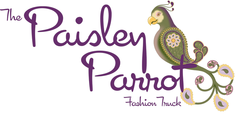
Pairing Parrot and Paisley...
We felt like this logo should be a literal design logo--one where the imagery used directly ties to the type of business or the name of the company. In other words, we needed a parrot. So we designed the shape of the bird with an obvious nod to the paisley portion of the name and paired it with a clean, stylized font. Our art boards included green and complimentary neutrals to match the vehicle color as well as a slightly muted purple and bright yellow that helped create some energy and a little fun.

